Andrea Carrasco

A reusable setup for a Spotify-inspired interface.

I used AI to structure a Figma study of variables, tokens, text styles, and components.

Independent project. Not official Spotify work or Spotify documentation.

The brief I set myself.

Take an interface I use every day, work out which decisions in it repeat, and rebuild those as something reusable. I reviewed public patterns, used AI to structure the naming, and assembled the Figma file myself.

01 / STUDY

Look closely.

Screenshot the interface until the repeats start showing up.

02 / STRUCTURE

Name the decisions.

Separate primitives, semantics, variables, and components.

03 / REVIEW

Keep it usable.

Check that changing one token moves what it should, and nothing it shouldn’t.

The type: Inter.

Spotify uses Inter in the product. This study looks at how its hierarchy, scale and rhythm support the interface.

What the type doesInter carries the interface from navigation and metadata through to titles and controls. Its range keeps the system expressive at display sizes while staying clear in the everyday moments.
Inter / product typeface
Make room
for the music.
Aa Bb Cc Dd Ee Ff Gg Hh Ii Jj Kk Ll Mm Nn Oo Pp Qq Rr Ss Tt Uu Vv Ww Xx Yy Zz
0123456789 · ! ? & @
Display / LargeDiscover
Heading / BaseRecently played
Body / SmallMade for every moment.

Nine collections of Figma evidence.

Buttons, bound to variables.

Every fill, border, radius and label color points at a variable, so a theme change moves all of them at once.
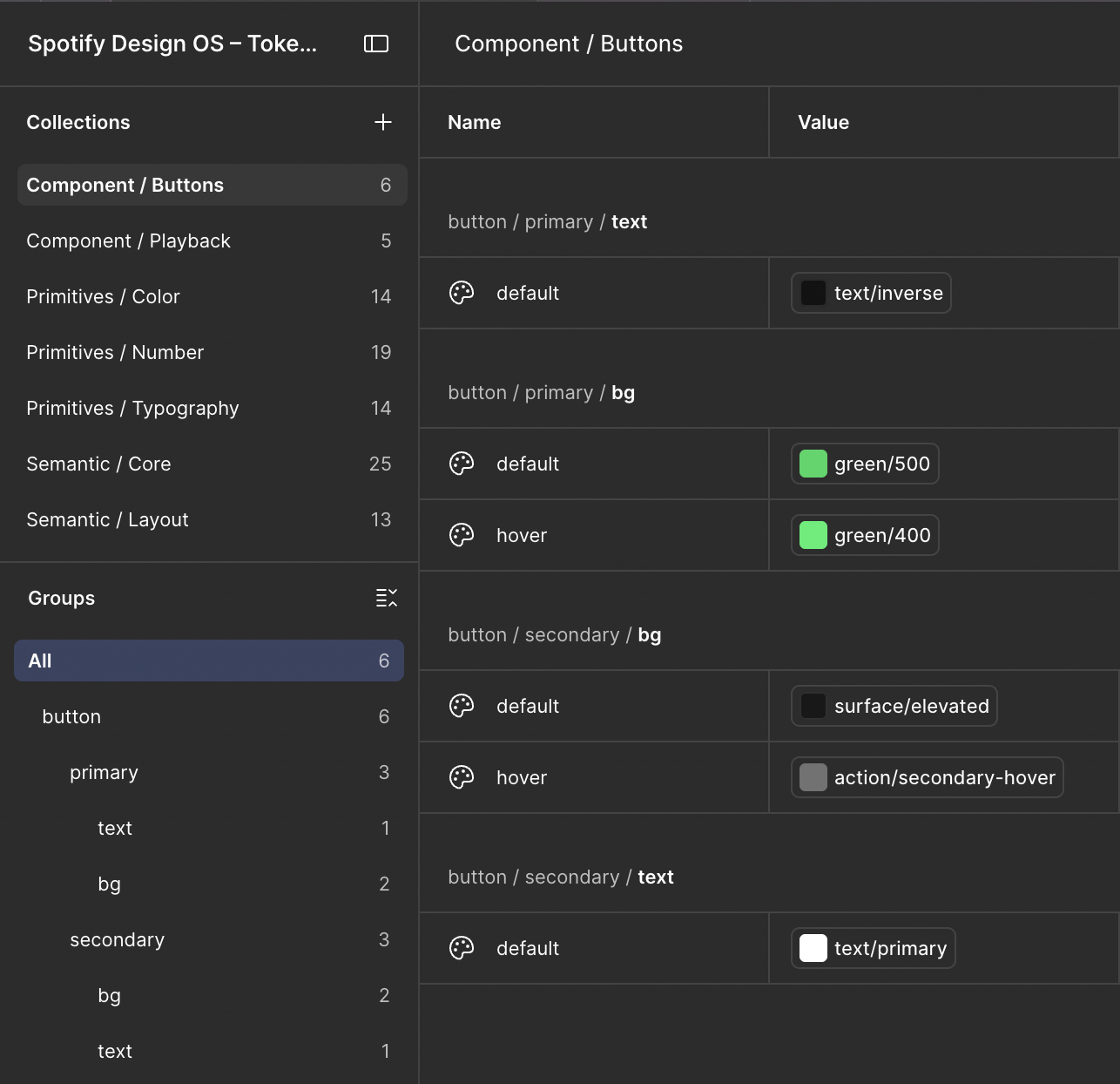
Figma variables for Component Buttons
Variables / Component Buttons

The controls that can’t drift.

Play, pause, skip, progress — the pieces that have to look identical everywhere they appear.
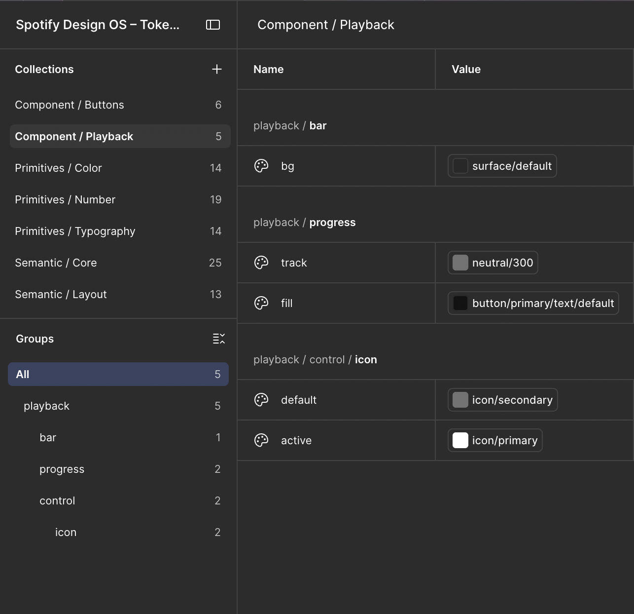
Figma variables for Component Playback
Variables / Component Playback

The raw palette.

Nothing here is used directly. Components reach the semantic layer, and the semantic layer reaches this.
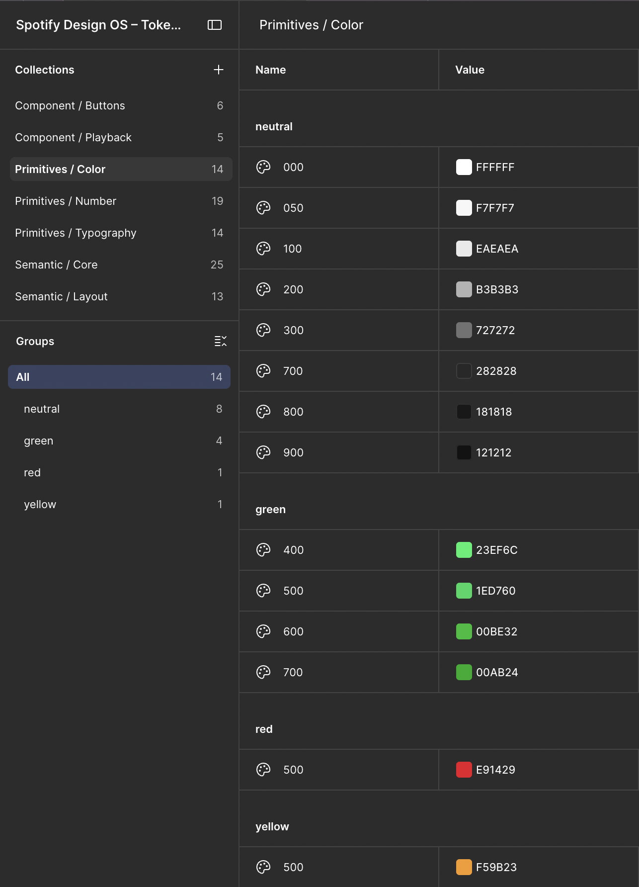
Figma primitive color variables
Variables / Primitives Color

Numbers as a scale.

Spacing, radii and sizes as numbered steps, so a gap is chosen from the scale instead of typed into the inspector.
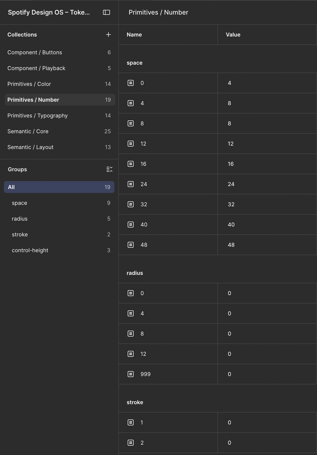
Figma primitive number variables
Variables / Primitives Number

Type, before it has a job.

Families, weights and sizes as a pool. The named text styles below draw from it.
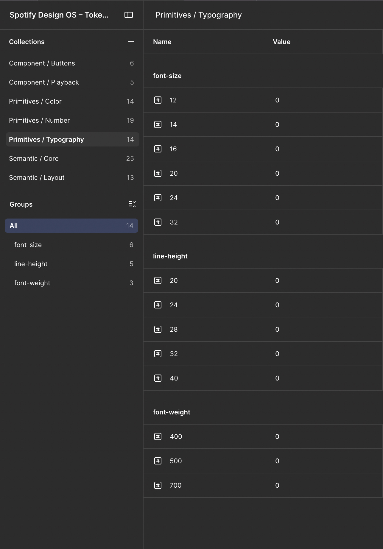
Figma primitive typography variables
Variables / Primitives Typography

The layer components actually use.

Surface, text, border, accent. Renaming a primitive never reaches this far, which is the whole point of the split.
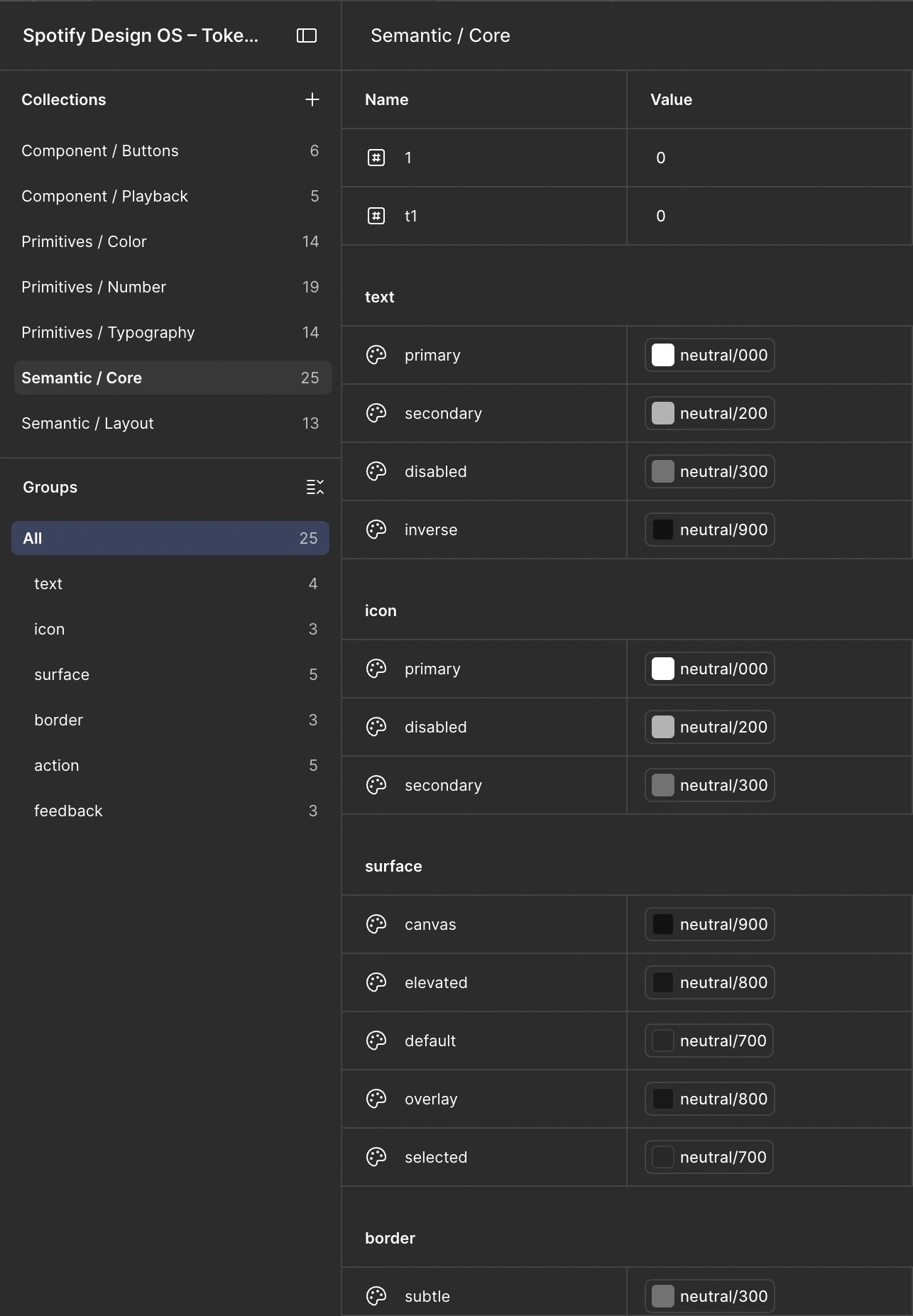
Figma semantic core variables
Variables / Semantic Core

Spacing with a role attached.

Container padding and stack gaps mapped onto the number primitives, so layout is described rather than measured.
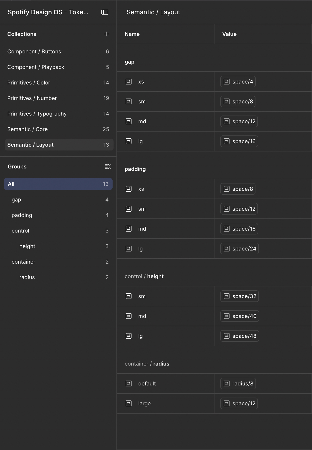
Figma semantic layout variables
Variables / Semantic Layout

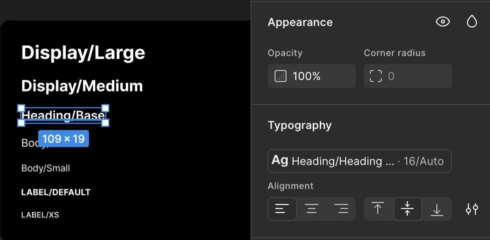
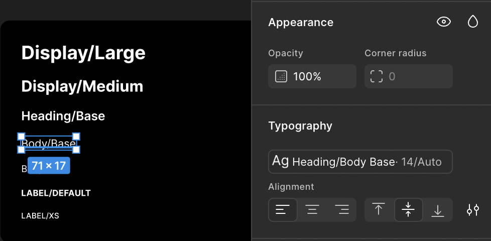
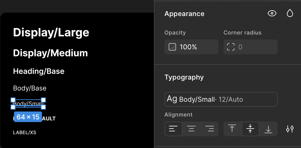
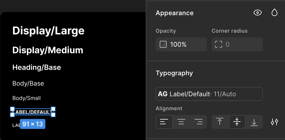
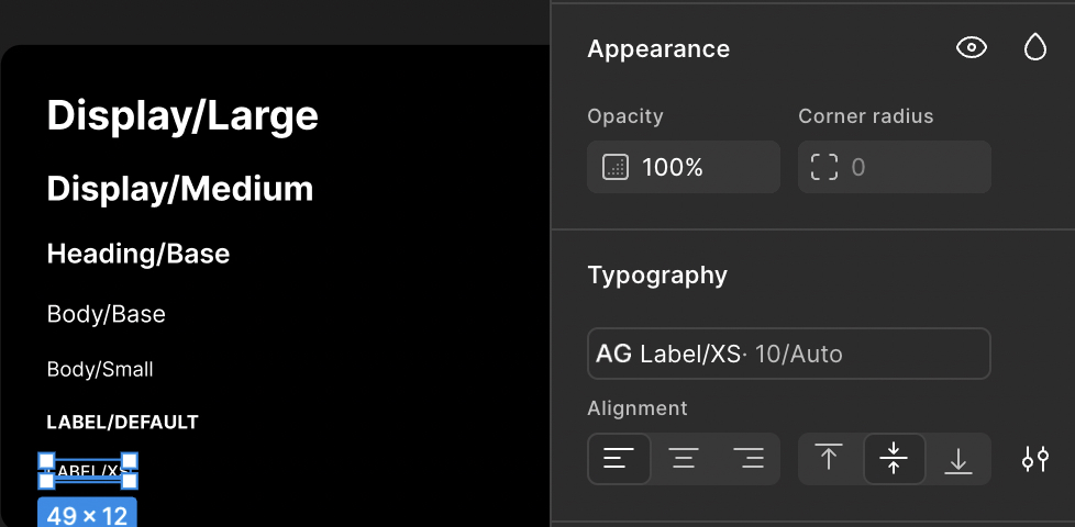
Seven text styles, and no more.

If a size isn’t one of these seven, it isn’t in the system. That constraint is what keeps the interface readable at a glance.
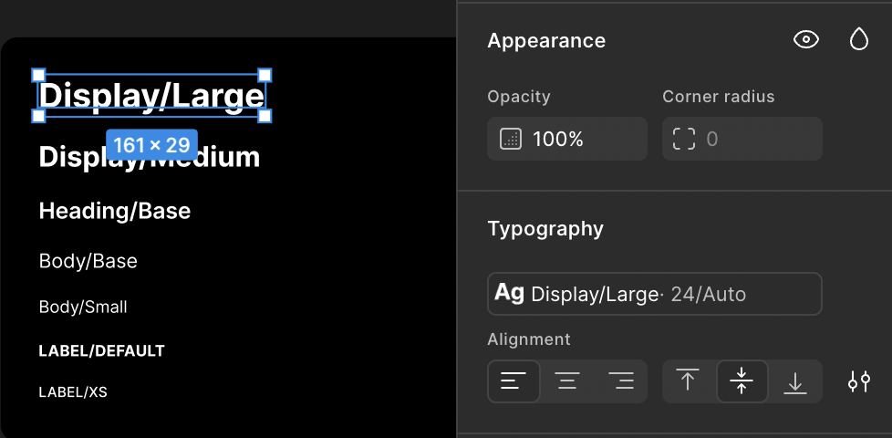
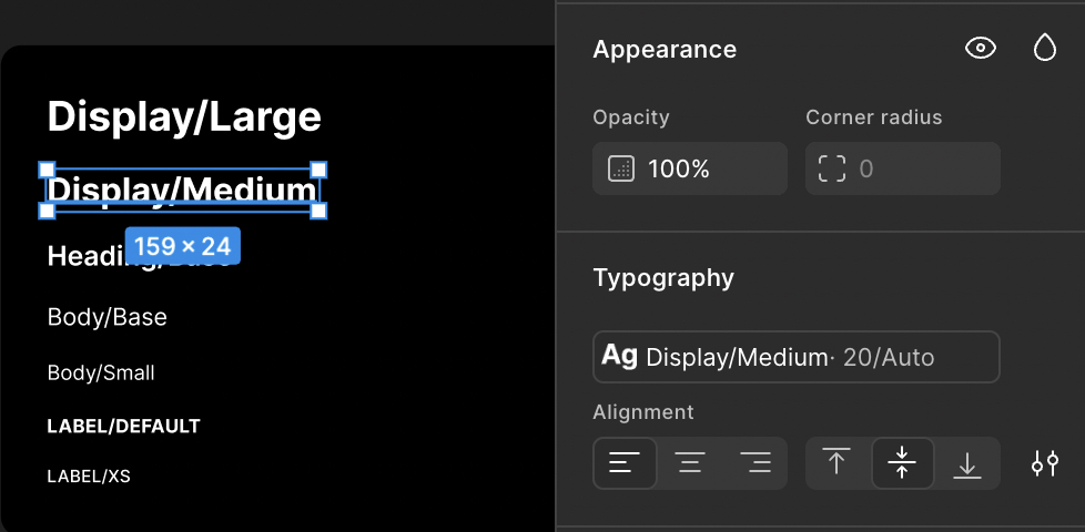
Figma text style Display Large
Display / Large
Figma text style Display Medium
Display / Medium
Figma text style Heading Base
Heading / Base
Figma text style Body Base
Body / Base
Figma text style Body Small
Body / Small
Figma text style Label Default
Label / Default
Figma text style Label XS
Label / XS

Cards, across three states.

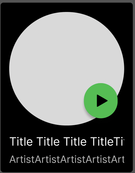
Song and artist cards compared at rest, on hover, and once selected.

Song Card

01 / Default
Song Card default state from supplied Figma study
Base presentation
02 / Hovered
Song Card hovered state from supplied Figma study
Play affordance appears
03 / Clicked
Song Card clicked state from supplied Figma study
Selected card state

Artist Card

01 / Default
Artist Card default state from supplied Figma study
Base presentation
02 / Hovered
Artist Card hovered state from supplied Figma study
Play affordance appears
03 / Clicked
Artist Card clicked state from supplied Figma study
Selected card state

The components, live. Click one.

Pick a study, then hover and click it. The status line reports the state the component is in — most of these change appearance rather than label.
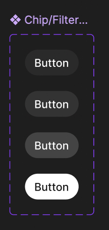
BUTTON SANDBOX

Filter chip

Default state

Hover, then click to see the state change.

Figma evidence for the filter chip
Figma evidence / supplied component study

AI was the assistant, not the author.

AI helped organize patterns, tokens, names, and consistency checks. I made the design decisions and assembled the Figma studies.

DISCLAIMER

Independent Spotify-inspired study. Not official Spotify work or documentation.